
Finding a great color scheme can make the world of difference when it comes to creating a website that’s both eye catching and functional. As a leading Charlotte web design agency, these are two of the qualities we look to implement on every site.
Finding that perfect match can make any site more appealing and helps to be more effective in keeping content and visual hierarchy clearly defined. Below are some suggestions on how to choose an effective color scheme.
Color scheme and selection could be blown-out into a much larger post—perhaps even a series of posts on accurately selecting colors that represent your industry and brand. But I’ll try to keep it brief and pertinent to color scheme selection.
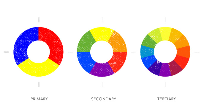
To better understand what colors work well together you’ll need to revisit color theory history. Remember the color wheel? Well, it all stems from that. Primary colors (red, yellow and blue) make-up all the goods. From there, you get secondary colors which is like the color wheel x 2. The third step is the tertiary colors, which is one more level of color division from mixing a primary and a secondary.
Now that we’ve refreshed our understanding of how colors are formed, we now to need to know how to make them harmonize. To create color harmony you need to make them flow and feel like they belong together—much like the notes in a song, hence the harmony. You need to achieve the perfect balance of color to really make a site flow. Too little color and site may come across dull and too subdued. On the other hand if colors are too extreme, the site can become visually distracting and may deter visitors. Color harmony can be achieved by creating the perfect balance. Two of the most common formulas for harmony are to use analogous colors (colors that are side-by-side on the color wheel) and complementary (colors that are opposing each other on the color wheel).
So, how do you go about picking the colors for your website? Most likely you’ve already got an idea of colors from your logo. Hopefully your collateral is firing on all cylinders and looks like a cohesive family. Most of the time your logo is only going to consist of 2 or 3 colors. If it’s got more than that contact us today because it’s probably looking a hot-mess and needs some attention. You can use one of the two formulas above to pick your supporting colors or can take a look to some external resources that have made the process a little easier and give you many more options.
When choosing a color scheme I tend to look at the client’s industry and make sure the color scheme is doing a good job of maintaining the brand’s consistency as well as staying-true to the industry’s feel. As a designer I will typically look to some of the built-in tools Adobe’s creative software provides to select these. The color guide pallet is a wonderful tool that allows you to select your color and then view buit-in formulas that create concrete, pleasing visual pallets. This is my go-to tool.
If the Adobe’s color pallet is not giving you enough inspiration there are a slew of other external websites that can give color scheme selection. Most, in my opinion, are junk (prove me if I’m wrong) with the exception of Kuler (also from Adobe). Kuler came out a while back probably 5 or so years ago. When it first made a splash I gave it a try and sorta thought it was a lot of work to do more or less the same thing the color guide pallet does. Then Kuler released the ability to load right into the CS suite which was pretty sweet. Then Kuler was taken down and totally revamped. Now, I have a new found love for it. Kuler is like color picking on steroids. They’ve even got an app to allow you select colors based off inspirations you see out in the world and then save them to your Adobe account.

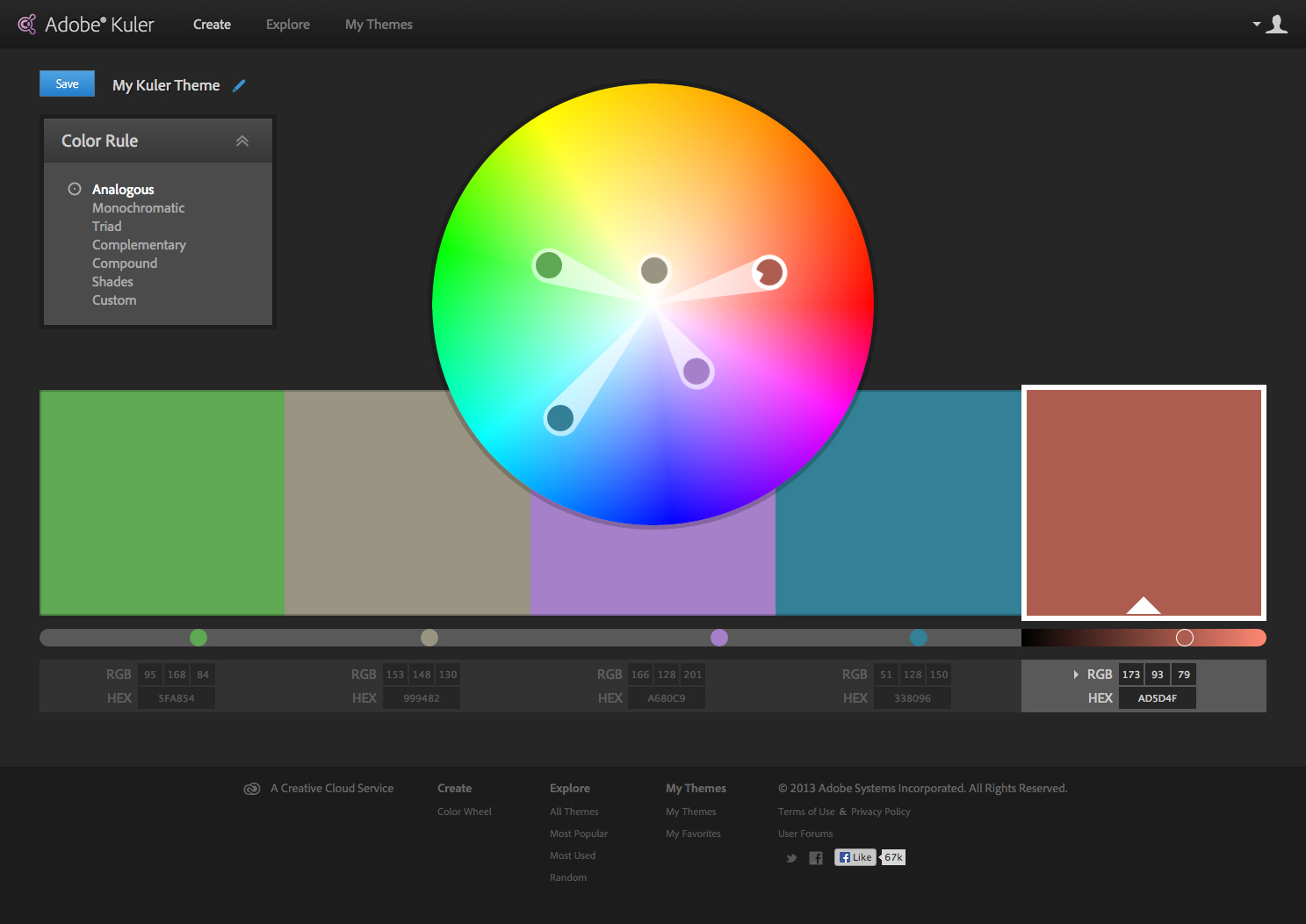
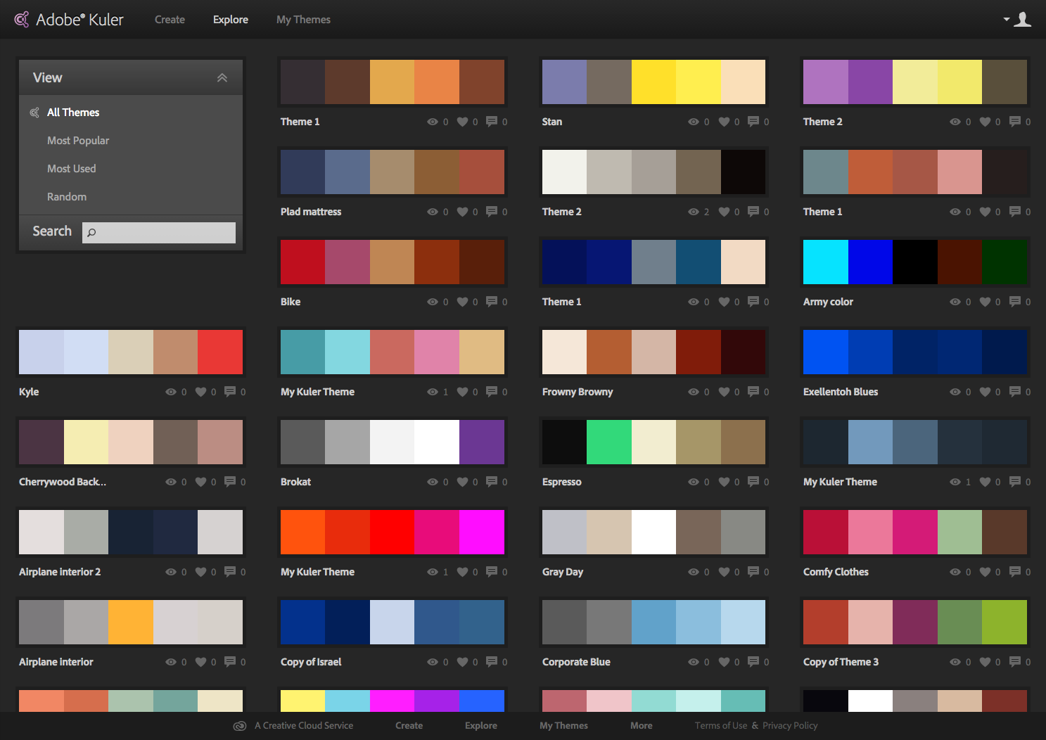
You can also save all your themes, view other’s and trending color themes, plus have them loaded right into your CS. Kuler is compatible with CS4-CC so you can access all your saved themes.
That’s my take on color, what’s yours?